Colour Theory Basics for Adult Colouring
Zen Colour Art Studio··5 min read

The wheel, simplified
Forget the design-school jargon. For colouring, you need three ideas:
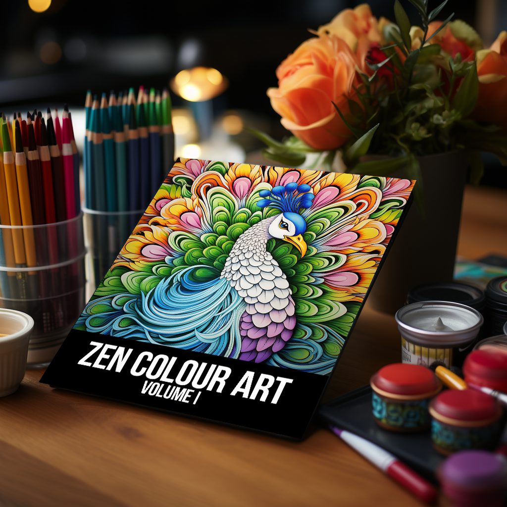
- Warm vs cool. Warm tones (red, orange, yellow) feel energetic. Cool tones (blue, green, violet) feel calm.
- Complementary pairs. Opposite on the wheel = maximum contrast. Try blue + orange.
- Analogous palettes. Three neighbours on the wheel = effortless harmony.
The 60-30-10 rule
Use one colour for ~60% of the page, a second for ~30%, an accent for ~10%. Instant balance.
Try it tonight
Grab any Doodle Garden spread and limit yourself to three pencils. Constraints make better art.
#colour theory#tutorial#technique#beginner